I worked on a large-scale smart stadium initiative in Los Angeles, contributing across multiple products within a fully cashierless, sensor-driven venue ecosystem. This case focuses on the redesign of a bartender-facing Point of Sale (POS)—a critical touchpoint that had broken the promise of a frictionless fan experience.
The original POS was slow, unstable, and misaligned with real bartender workflows, leading staff to abandon it and fall back to traditional payment terminals. Through on-site research, observation, interviews, and iterative prototyping, we redesigned the POS to reduce cognitive load, restore trust in the system, and better support the fast-paced reality of bar service.
The solution balanced flexibility and structure: clearer fan identification, more resilient flows, a secure tipping experience, and interaction models adapted to different event contexts. While still under development, the redesigned POS is expected to significantly improve both bartender efficiency and fan experience—helping the venue deliver on its core promise of a truly frictionless smart stadium.
Overview
For NDA purposes, I have omitted confidential details and the client name.
From 2023 through 2025, I worked on one of the most technologically advanced venues out there— a smart stadium in Los Angeles, California, home to a well-known basketball team. This venue was designed around one core idea: remove friction so fans can focus on the experience, eliminating typical barriers. No lines, no turnstiles, no physical ticket or QR codes, no checkout counter or self-checkout stations. Fans simply walk in, grab what they want, and go to their seats to watch the game or concert they came for. Everything is designed with the purpose of letting the fan get to the action as soon as possible.

To make this vision possible, five products work together:
- Fan App – the way fans control their experience inside the venue.
- Staff App – the tool for staff to assist fans, control access, make sales and many other work-related tasks.
- IoT Devices – the stadium as an interface. Fans and staff interact with these devices to automatically redeem tickets, access different locations, identify themselves and validate payment methods.
- Website – the primary touchpoint to communicate the venue experience.
- Admin Tool – the control center for higher-level staff (inventory, access, device management, security, and more).
I was part of a large cross-functional, international team across Latin America, India and the US, that led strategy, design, implementation, and orchestration in a project that included many tech vendors.
Throughout this project I contributed to multiple initiatives across all 5 products:
- An access management feature, that allows staff members at entrance to detect fans that don’t have a ticket or an account while they’re accessing the venue, so they can assist them.
- A redesign of a point of sale (POS) for bartenders in a cashierless environment — the focus of this case study.
- A complete redesign of the fan app’s account creation flow.
- Many feature enhancements across all products (in areas such as payments, ticketing, parking, commerce, access or VIP management).
For now, let’s dive into the POS. If you’d like to talk about any of these other initiatives (or the rest of my work), feel free to reach out!
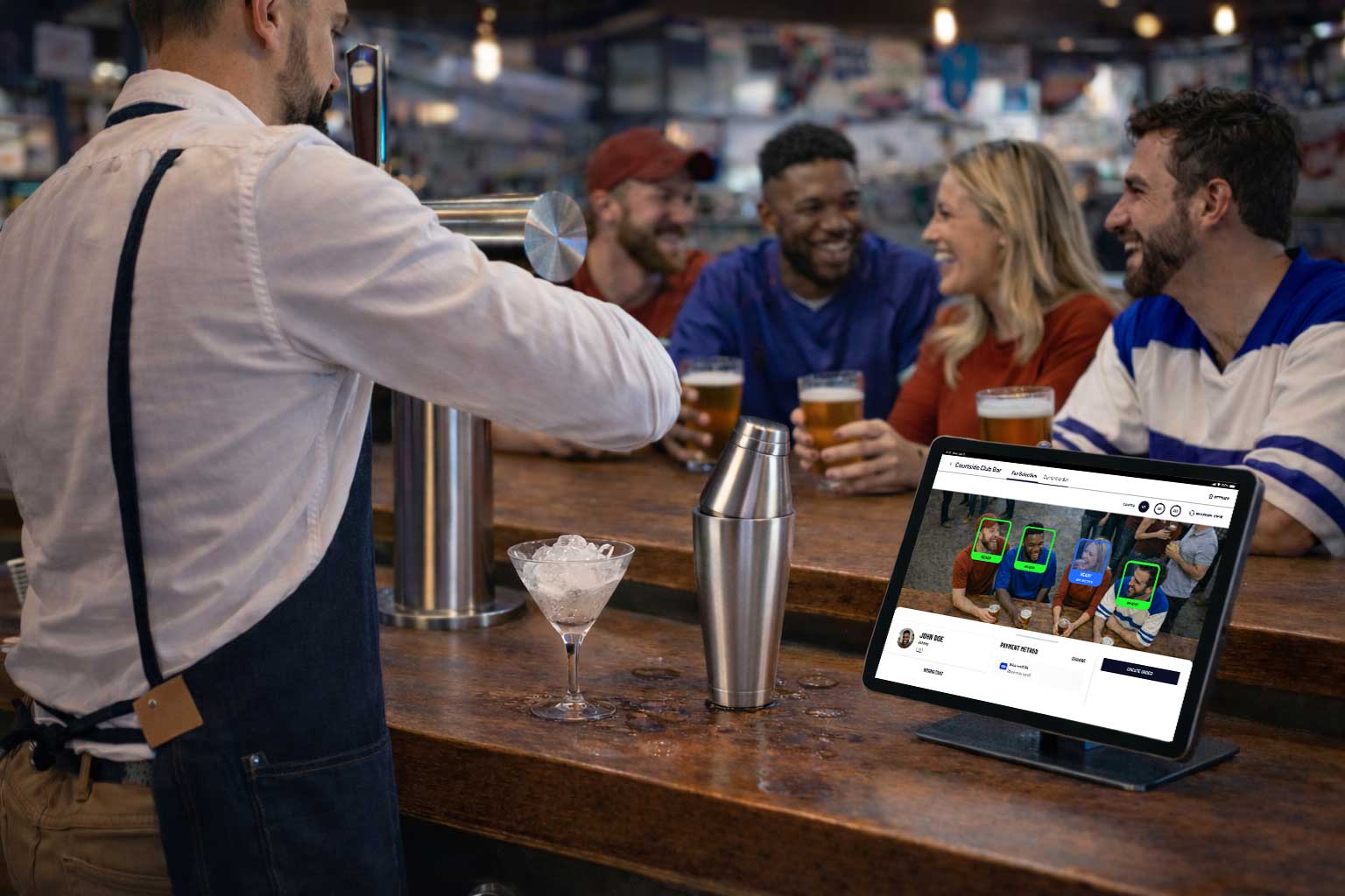
Not the usual Point of Sale
Some context
At the venue, all stores are fully automated. Fans can grab food, drinks, or merchandise and are automatically charged upon exit thanks to an advanced camera system and real-time item tracking.
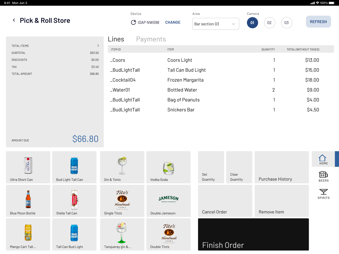
Bars are different though: fans can still pick packaged items, but cocktails and fresh drinks require a human bartender. That’s where the POS comes in. A tool for bartenders to:
- Identify the fan.
- Add made-to-order items.
- Let the system charge everything automatically after, along with anything else the fan grabs on their own.
This POS was supposed to fit the promise of a cashierless, frictionless experience — but the original version did the opposite.
The Problem
Before the redesign, the POS created a terrible experience for both bartenders and fans. It was such a pain to use, that bartenders abandoned it entirely and reverted to a traditional payment terminal.
Fans could walk out with snacks without “paying”, but ordering a drink suddenly required pulling out a credit card.
This broke the smart-venue core promise.
Our challenge was to redesign the bartender experience and create a POS that truly aligned with that promise.
My Role & Responsibilities
As product designer, I was responsible for:
- On-field research: observations, interviews, and testing (along with my colleagues, as part of a bigger “multi-scope” research plan).
- User flows and prototyping.
- High-fidelity mockups for all states and scenarios.
- Walkthroughs and handoffs to engineering.
- Collaboration with vendors to align in possibilities across systems and analyze user flows.
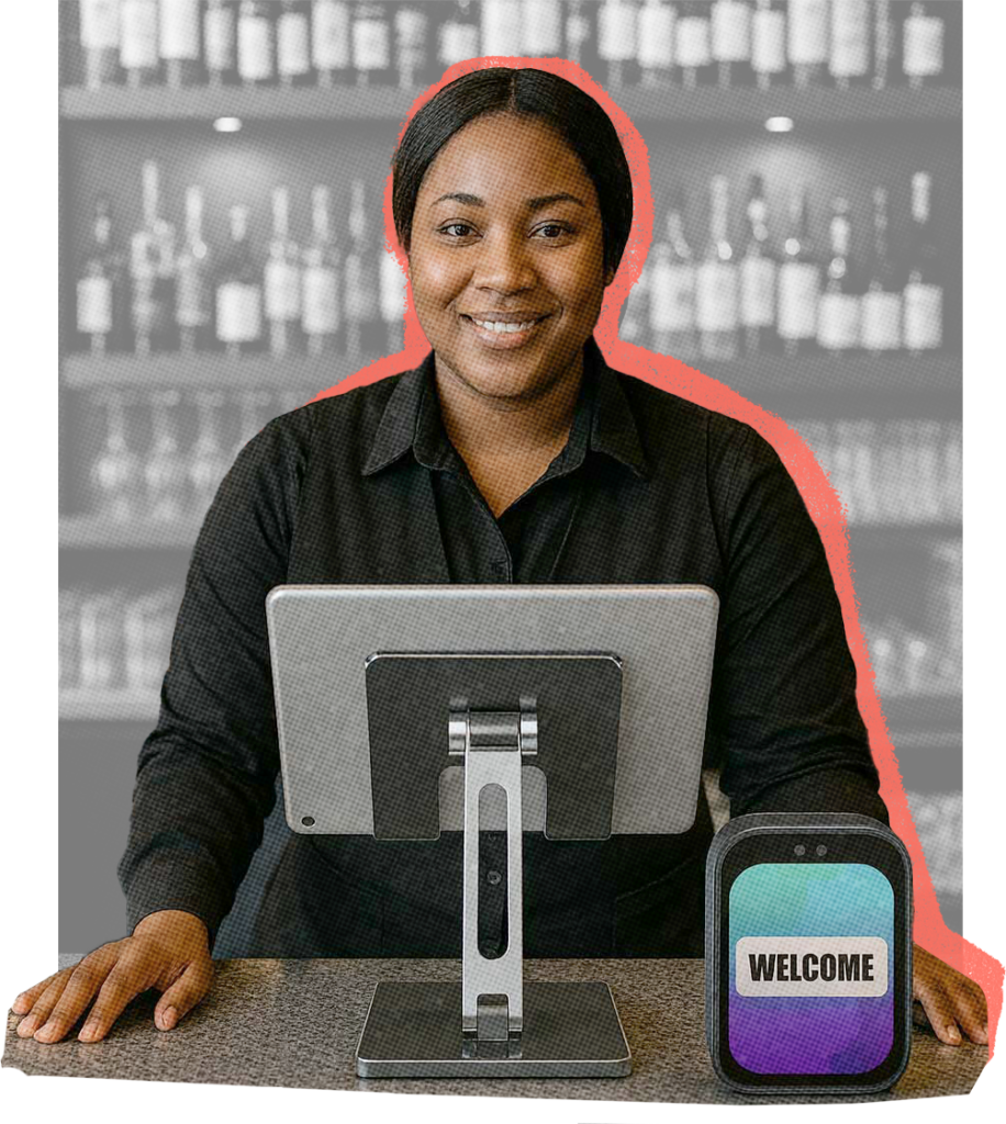
The Venue Bartender
User profile
- Operates under constant pressure: is expected to serve fast while maintaining high quality, both from customers and management. They frequently juggle multiple tasks at once — preparing drinks, politely interacting with fans, and registering orders in a system they’re not fully familiar with.
- Because the existing tools often don’t match their real workflow, they develop their own workarounds to stay efficient. Despite these challenges, they are highly trained in customer service and genuinely motivated to keep fans happy — not only because it’s part of their job, but also because tips represent a significant portion of their income.
- Most are experienced professionals who deeply understand the bartending business. They are also underpaid, making the tipping experience especially important.
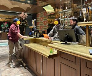
Before this redesign, I visited the venue twice — including opening night — with my design lead. Our role was to help the onsite QA team understand a lot of scenarios in the fan journey and doing field observations of fans and staff behavior in this new environment. During these visits, we observed many real interactions with the POS and had conversations with bartenders.
These early observations gave us a detailed initial picture of bartenders as users, which we later expanded through the specific on-field research for this project.
The Previous POS
Step by step of a turbulent user experience
Jenn, a basketball fan, walks into a food store. An IoT device verifies her account and payment method through facial recognition before letting her in.
Once inside, overhead cameras track everything she picks up, and she will be charged automatically once she leaves. Jenn approaches the bar and orders a drink from Marcus, the bartender.
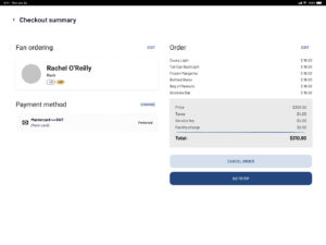
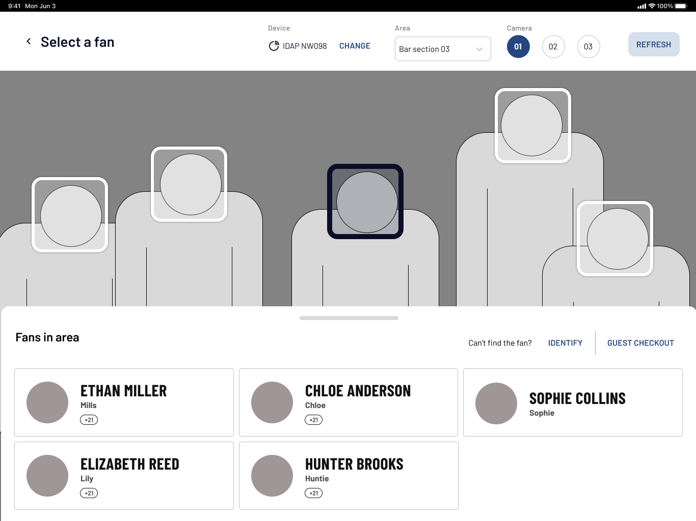
Once the cocktail is done, Marcus goes to the iPad to find her in the “Fans in Area” list — but Jenn appears as “Unknown fan.” He taps the entry to re-identify her using the IoT device and asks her to look at it.
“Didn’t I already do this at the entrance?” Jenn asks, confused.
“I know… sorry about that,” Marcus replies, feeling a bit nervous as he waits for the device to respond.
Pain points
- Recurrent “Unknown Fans”: The system frequently lost track of fans, turning this «re-identification» flow into a constant task for bartenders.
- Unstable IoT devices: These custom-built slow and unresponsive devices created stressful interactions and diminished staff trust in the system.
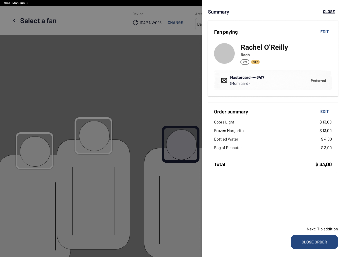
Once Marcus manages to identify Jenn, he selects her profile and adds the drink to her order. Jenn, already holding her drink, is beginning to grow impatient.
“Are we good?” she asks, trying to be polite but clearly in a hurry.
“Almost there…” Marcus answers while navigating the cluttered UI, hoping nothing glitches.
Pain points
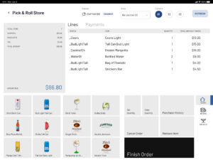
- Unnecessary UI complexity: A split interface with separate “Fans in Area” and “Open Orders” lists increased cognitive load in a workflow that only involves one order at a time.
- Unstable ordering UI: Poor integration between systems led to inconsistent behavior, lost orders, and accidental deletions.
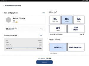
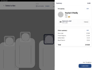
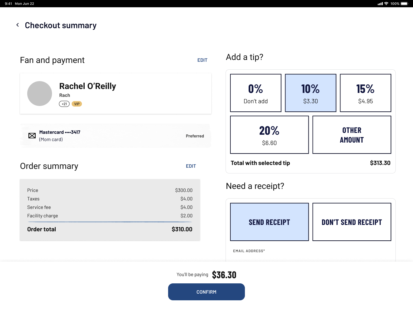
“Oh—right, the tip,” Marcus says quietly to himself, relieved he remembered. Before closing the order, he taps on “Add tip” and turns the iPad toward Jenn so she can choose a tip percentage.
Pain points
Tipping as an afterthought fix: Tipping was not part of the core flow, forcing bartenders to remember it and triggering it manually, often resulting in lost tips.
Jenn selects a tip amount and taps “Confirm.” She is returned to the previous screen with her open order. Thinking she’s expected to finalize it, she taps “Close order”, hands the iPad back, and leaves.
Once Marcus looks at the iPad, he sees the default screen with no open order — and he has no idea whether Jenn’s order went through or was accidentally canceled.
Pain points
Lack of feedback and clarity: Unclear system states caused fans to close orders themselves, leaving bartenders unsure whether transactions succeeded.
No access to order history: Bartenders had no way to verify completed orders or tips, as transaction data lived in a separate section they couldn’t access.
Ideating a Solution
We held a working session with the client and key vendors to align on pain points and define the core requirements for the new POS:
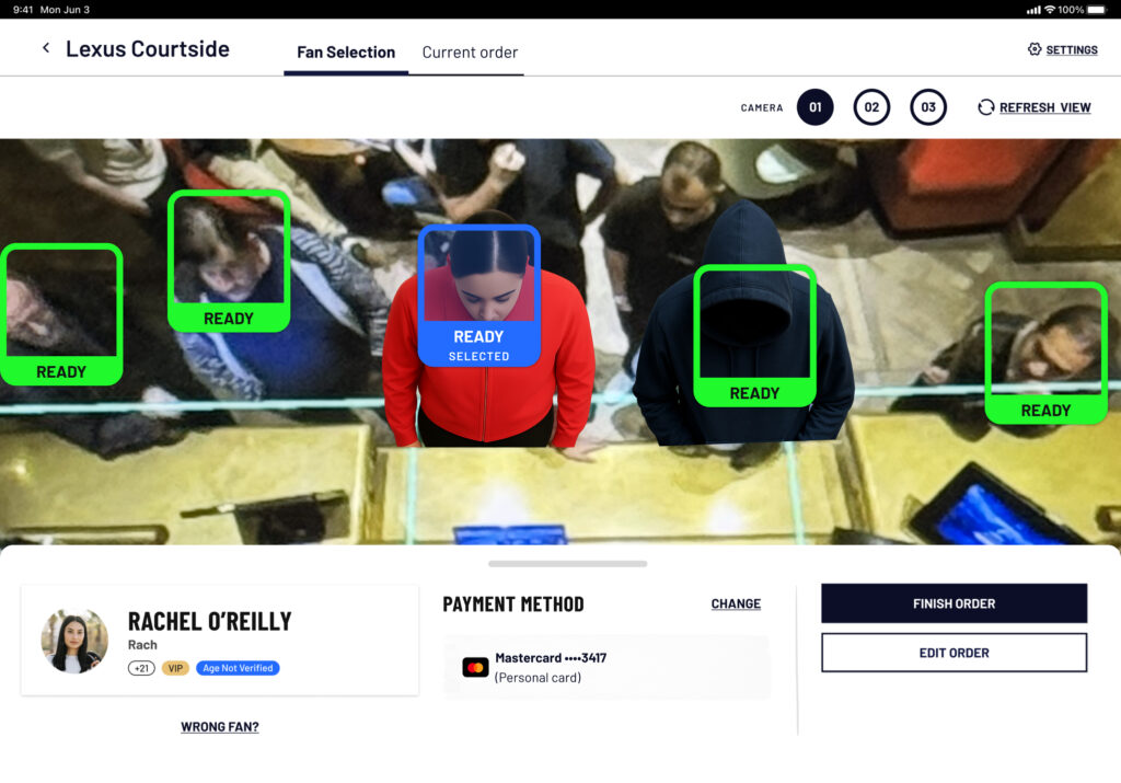
- Fan identification must be clear and unmistakable: We collaborated with the camera and identification teams on a proof of concept to create a more visual, immediate way for bartenders to identify fans.
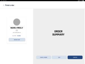
- Fan selection and order creation should be two distinct steps to reduce cognitive load.
- Tipping must be part of the main task flow, and once a tip is added, fans shouldn’t be able to edit the order.
- The technology stack must address existing instability issues — such as integration glitches, the high number of “unknown fans,” and the lack of access to purchase history for staff.
User flows & initial structure
I began by diagramming the new user flows — not thinking in “screens,” but in the sequence of actions (and their required order) needed to complete a bar sale using the POS. This step was essential for understanding the logic behind the experience before shaping any UI.
This user flow summarizes the main interactions in a bar scenario
Wireframing different approaches
Then I moved into wireframing. My first instinct was to structure the POS in a strictly linear way, reflecting the step-by-step process we wanted.
However, bartending is not linear. It’s dynamic, fast-paced, and full of interruptions.
So I explored ways to build flexibility into the flow, allowing bartenders to switch seamlessly between fan selection and order creation at any point — without losing context, and without compromising focus on one action at a time.


Early explorations
Fan identification concepts
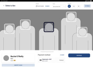
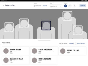
For the fan selection step, I explored two approaches:
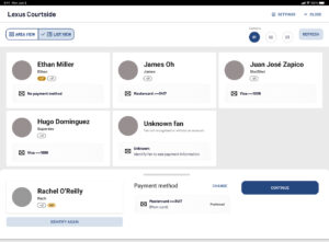
- Enhanced List View
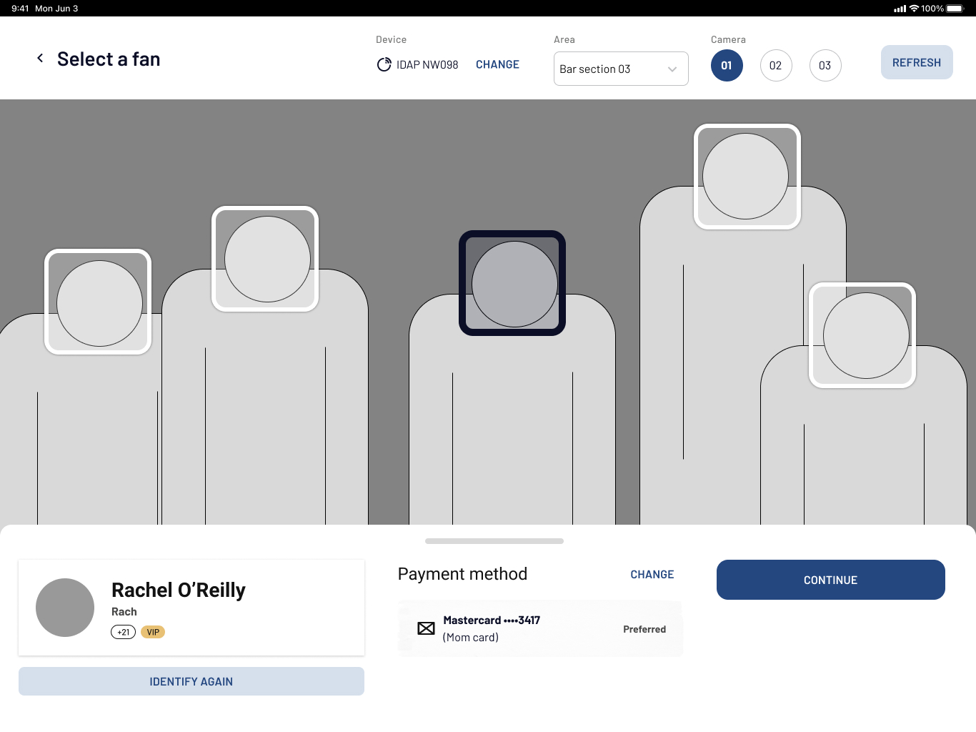
An improved version of the existing list-based model, with better information hierarchy, cleaner navigation, and more screen real estate. - “Area View” (Spatial Mapping)
A top-down view that mirrors what bartenders see in real life — made possible after validating with the camera tech team that this representation was technically feasible.
These two approaches represented different modes: one focused on fan information, the other on physical space. User testing later showed that each had strengths depending on the type of event.
Tipping & checkout
For tipping and checkout, I worked on a dedicated “handoff screen” that locked the interface into a fan-facing view that communicated the customer to return the device. This prevented users from navigating elsewhere and ensured that once a tip was added, the order remained secure.
Edge cases
I also designed wireflows to cover the most critical edge cases, including:
- Payment failures
- Unverified accounts
- Tracking or identification errors
These were frequent occurrences in the previous system, so designing for them was essential.
While I was responsible for designing the new solution, I worked within a larger design team that tackled multiple initiatives in parallel. Our collaborative design reviews played a key role in refining the flows, challenging assumptions, and improving the final direction.
User Testing
Once we had strong wireframes, we still needed to answer several key questions:
- Does this solution make sense in real service conditions?
- Area View vs. List View — which one helps bartenders the most?
- How do bartenders feel about identification, IoT devices, and payment methods?
- Do they prefer to start “order first” or “fan first”?
- How do they respond to the new tipping flow?
- Which unknown pain points are still out there?
To address these questions, we planned combined user testing and interviews, since we needed both solution validation and qualitative insight.
An interactive prototype of the main flow tested
Three colleagues and I traveled to Los Angeles to carry out an ambitious research plan that also included other initiatives and user groups. For the POS specifically, we ran sessions with 9 bartenders (ages 20–50s, with mixed levels of experience). Each session lasted two hours and included:
- 7 task flows
- Ordering roleplay
- Deep-dive questions after each flow was finished
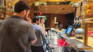
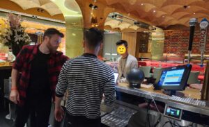


Sessions were conducted in one of the venue’s bar areas to replicate real conditions as closely as possible. I moderated some sessions and observed others.
What We Learned
Surprisingly, all users successfully completed the tasks we proposed to them, with a couple of minor exceptions, and the prototype was well received by most of them. I always like to think that a user test is a success if the prototype is a failure. But this wasn’t the case. Thanks to months of previous observation, most of our assumptions were right.
Some key insights from user testing:
- Flexibility matters. Bartenders often start with the order before selecting a fan — especially when it’s busy, but that’s not always the case.
- Area View works best for concerts (high fan turnover), while List View works better for games (regulars).
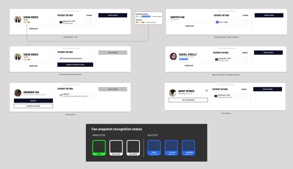
- Fan status needed clearer states (identified, unknown, missing payment method, etc.).
- Inventory navigation required improvements, although these happened in the embedded system created by another vendor.
- Trust in IoT devices was low, specially when having to collect payment methods with them.
Iterating and defining
Back home from LA, I iterated the prototypes addressing the insights to do some adjustments. But as I said, most of what was tested performed well. I also moved into high-fidelity mockups, built new components, and reused existing design system elements whenever possible.
Being a work tool, the Staff app look and feel does not prioritize beauty or aesthetics in the UI, but rather instant comprehension and utility.
I collaborated closely with PMs to write user stories and led functional walkthroughs with devs after each flow was validated by the tech team and the client.
Outcomes & Lessons
At the time of writing, the redesigned POS is still under development. The new experience is expected to have a meaningful impact on both bartenders and fans by having addressed the most critical pain points.
For bartenders, the redesigned flow aims to reduce cognitive load and better support the fast-paced nature of bar environments. Clearer fan identification, more stable flows, and an improved tips experience are expected to help bartenders focus on serving fans efficiently and delivering great customer service.
For fans, the new POS is designed to restore consistency across the venue experience. Ordering a drink should feel just as seamless as grabbing a snack — reinforcing the promise of a truly frictionless smart venue.
Some lessons learned:
- Combining user testing with interviews proved powerful for a specialized user group like bartenders.
- For complex, non-traditional systems like the one in this venue, users should be involved from day one. Especially workers and internal users. Their mental models and business knowledge are essential.
- User tests can be interrupted by observant stakeholders — staying calm, properly communicating the rules of a user testing session and respectfully reinforcing boundaries is key.